Packaging Design
Hygiene product category : Condoms
Hygiene products have always been a necessity for people's daily lives, among which condoms have a huge market demand. This project requires designers to create a condom brand, think about the brand identity and the corresponding target audience, and then design a logo and packaging design for it.
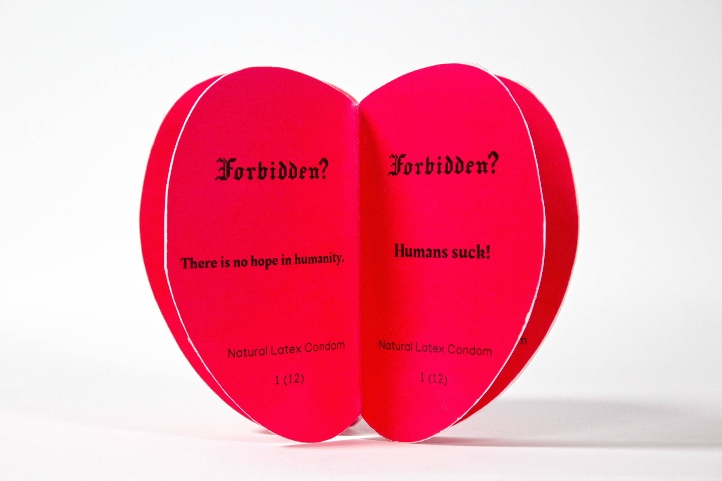
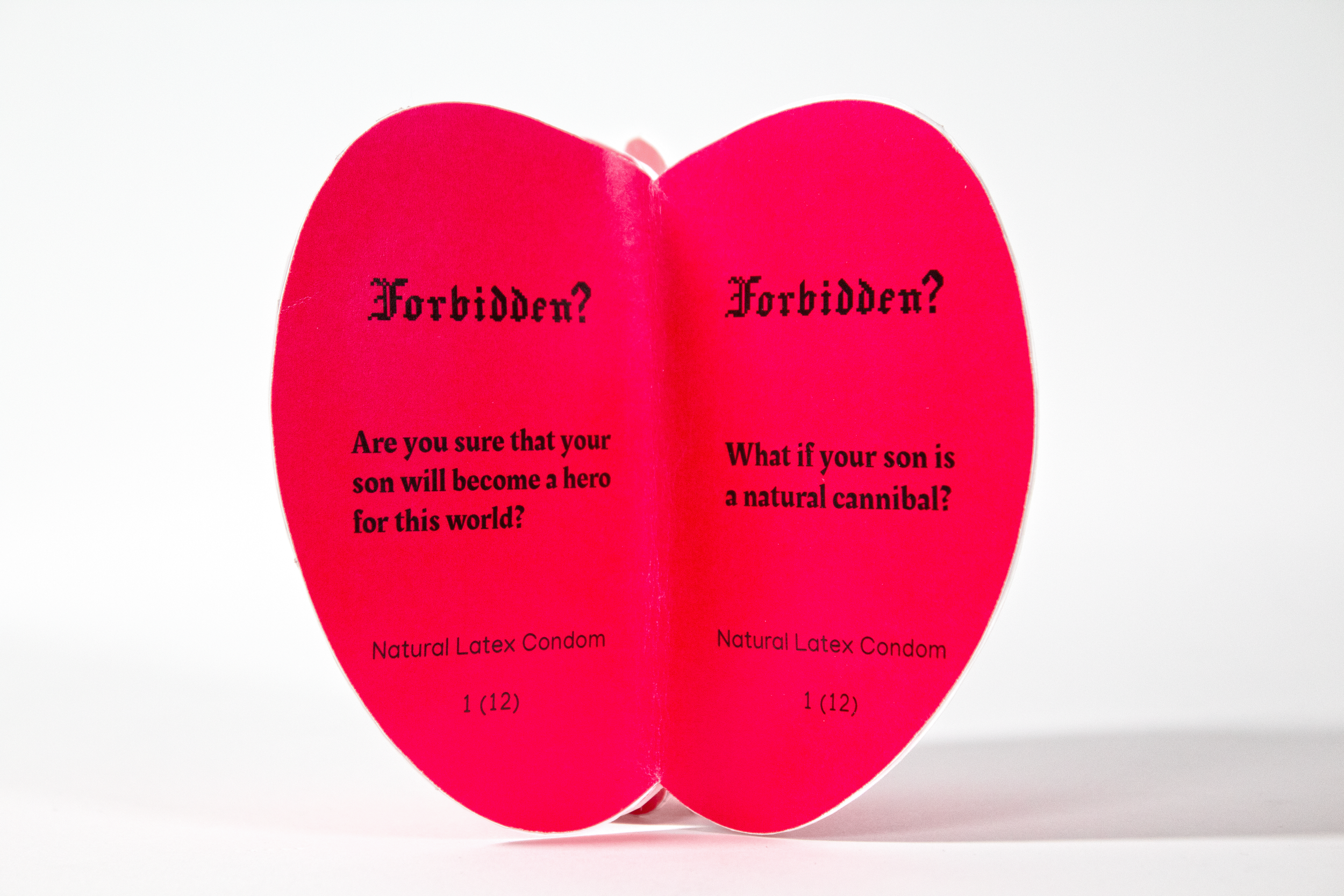
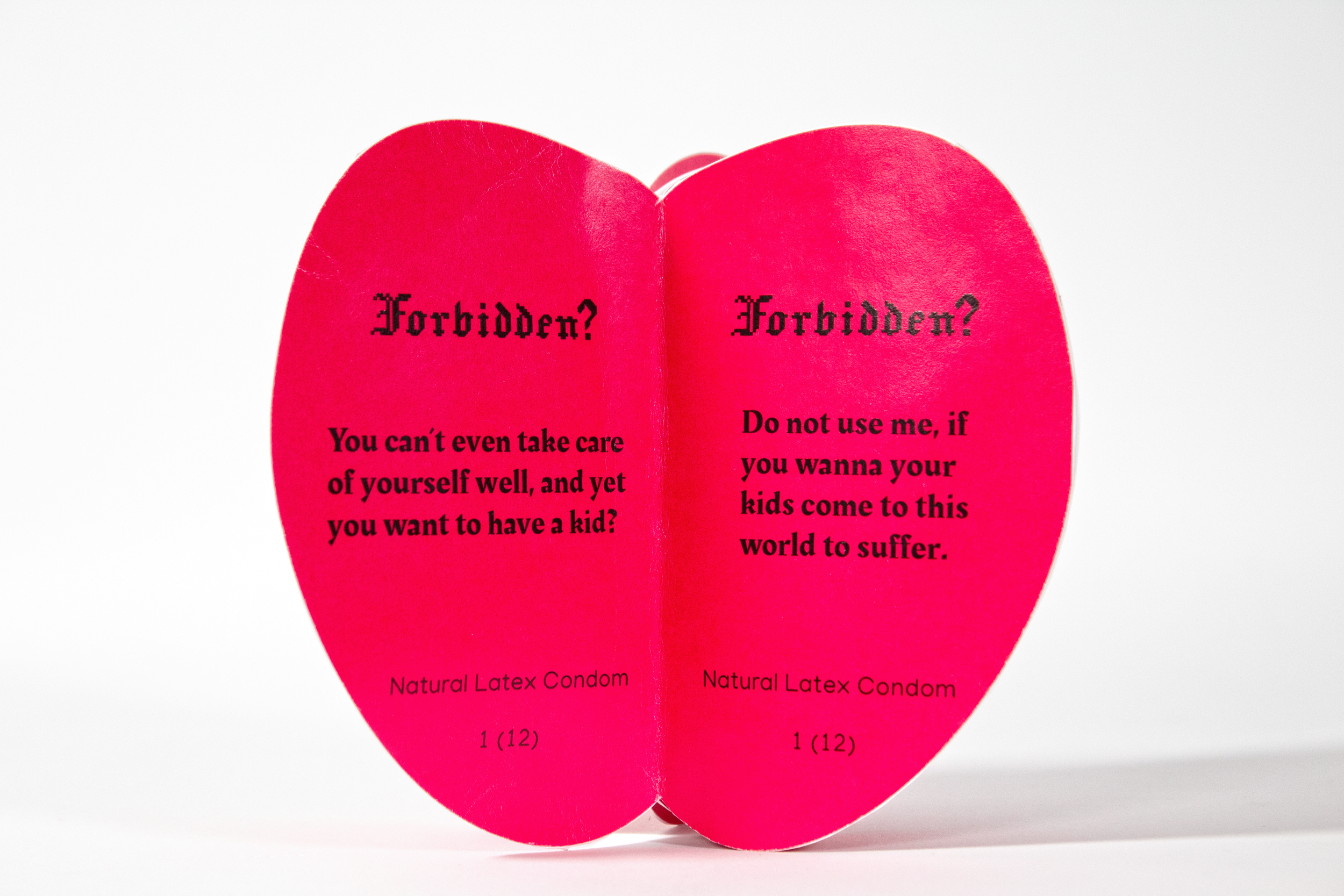
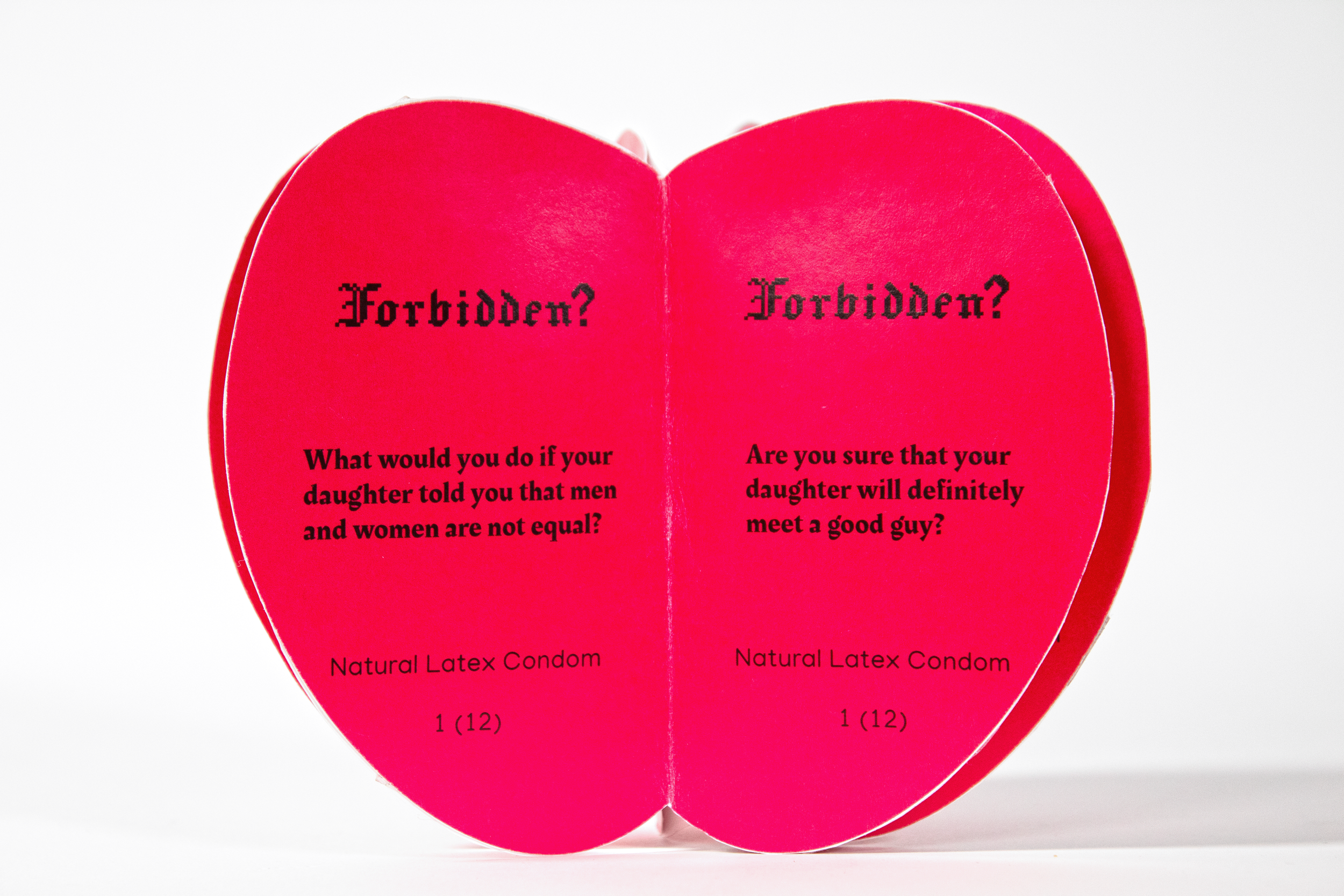
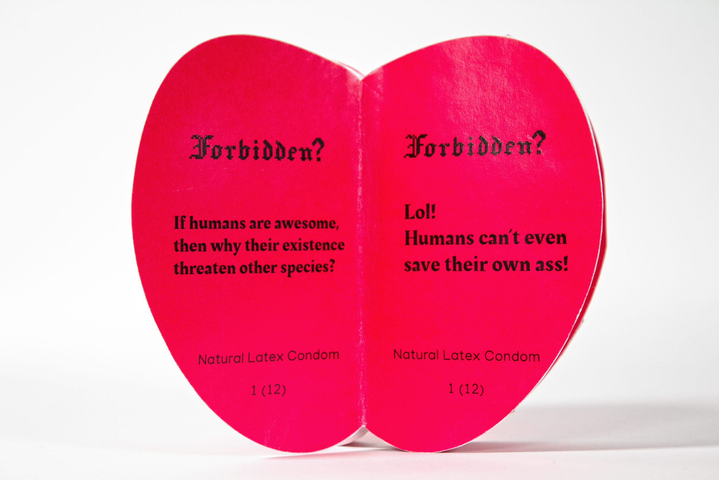
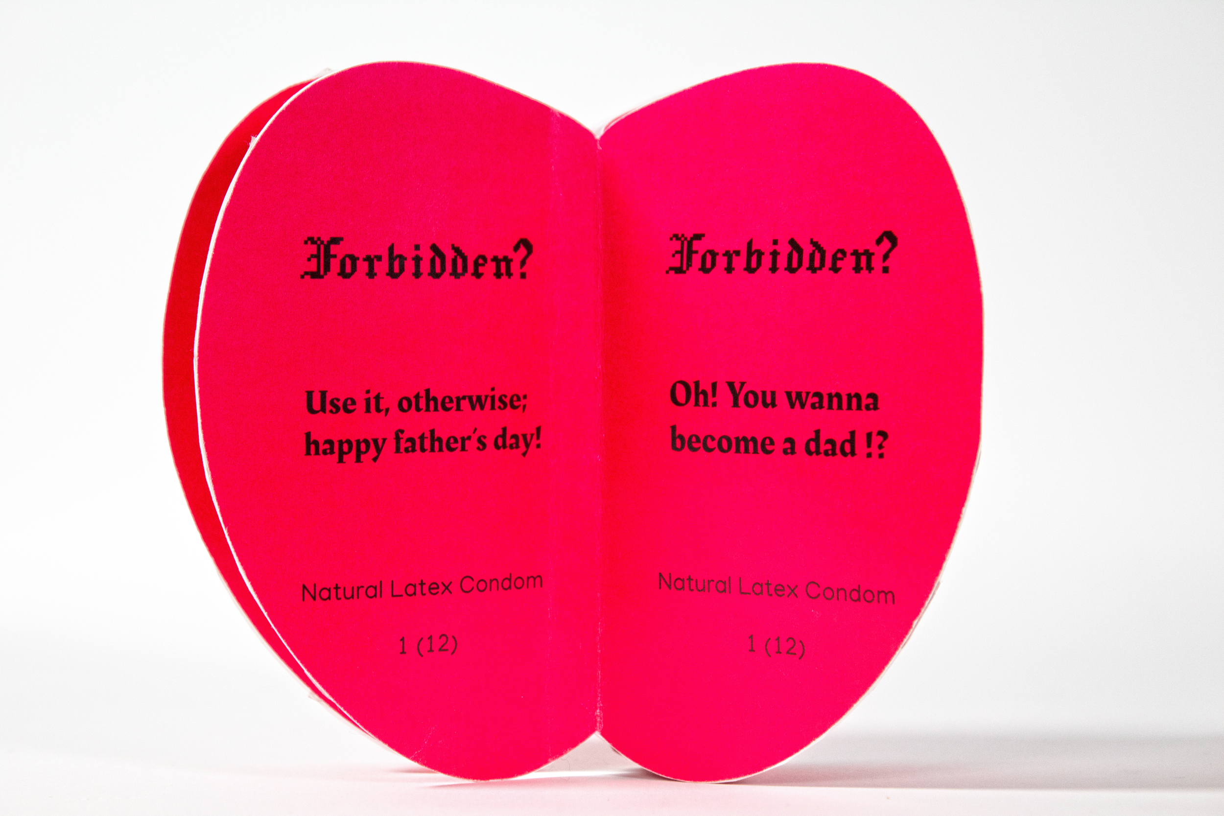
My design inspiration comes from the story in the Bible that Adam and Eve ate the forbidden fruit in the Garden of Eden and brought disaster to the world. Then I named "Forbidden" from the phrase "forbidden fruit" as the name of my condom brand.
Then the outer packaging was designed to look like an apple, because in most people's impressions, the forbidden fruit looks very similar to an apple and is bright red. But when I designed it, I didn't use bright red completely, but magenta. Because I think from the perspective of color psychology, bright and saturated magenta can attract the eye, but it will also give people the illusion that "this thing contains a certain amount of toxicity." Therefore, I decided to use magenta and then added the word ‘Forbidden’ in pure black font and used a pixelated Gothic style as the logo.
In order to make each petal look less plain, I added some funny words to each petal. Some are depressing, some are cynical, and some are thought-provoking.